Thoughts & Musings
Logo Design Examples with Vector Graphics
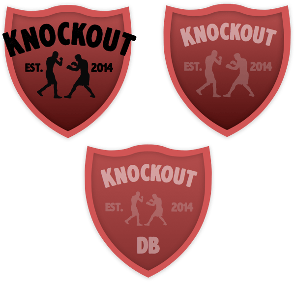
I just thought I'd share a couple of logo designs that I've been working on recently for a personal project. I've created these shields using vector graphics in Sketchapp. I had tried a number of different shapes but felt that the shield best captured the look I was going for.
The font that I have used is called AxeHandel, I feel that it's clear and readible while managing to give a nod to the old-timey boxing logos and posters that I grew up with. I tried gloves as the central focal point but in the end decided that the boxer silhouttes fitted a little better.
I think I'm going to use the third option, (center, bottom). Do you agree? Let me know your thoughts at @garethapdafydd.

Click to see the larger version