Thoughts & Musings
Designing the ClickHouse brand
I don't often write about work achievements, but this one is special, so I'm making an exception. Last week at ClickHouse, we unveiled an exciting new brand identity, complete with vibrant colours, distinctive typography, and a brand-new website. I wanted to take a moment to share a little bit about how we reached this milestone.

For me, this was a particularly interesting challenge. My professional background is mainly on the product side, and while I have been crafting brands for myself and others for over a decade, doing so for my employer proved to be a very different experience.
As a brief background, ClickHouse is a highly popular open-source database. Created in 2009 and open-sourced in 2016, it has accumulated over 28,000 stars on GitHub. It is a column-based database, and its key characteristics include being fast and resource-efficient.
Late in 2022, when we first started talking about updating our brand, we saw it more as an evolution of the existing identity rather than a full rebrand. We opted not to make major changes to the logo or the name, as we're still a young company and awareness of our current identity is incredibly important to us. Colours were something that we really wanted to address, as our existing palette lacked the dynamism that we felt matched our culture.
Discussion with our leadership team provided insight into our internal identity, while our field team helped us understand how others perceive ClickHouse, as well as our strengths and weaknesses. By combining these inputs with our own deductions, we created a list of core visual brand attributes. We were looking to create a brand that could effectively communicate the following:

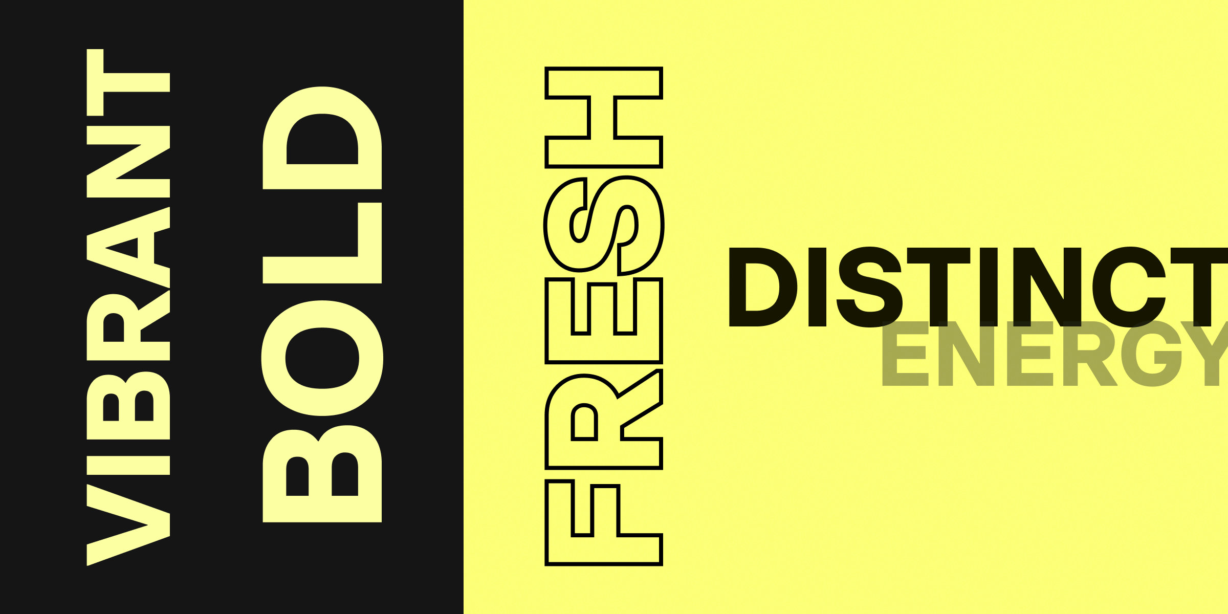
Vibrant, Energetic, Bold, Distinctive, Fresh
After conducting a little competitive research to see what insights we could glean from others in and around our industry, things began to get interesting for me. There were so many stylish, modern, well-crafted websites out there, websites that I absolutely loved on an individual level. Yet, I found myself struggling to understand the overarching brand for these companies. I, as much as the next designer, hugely appreciate space-themed, neofuturistic, pink-purple gradient-based websites. They inspire awe and feel cutting edge in today's online world, but if everyone is doing the same thing, how can anyone stand out? How does that approach effectively translate to meet-ups, conference booths, and a memorable offline experience for our prospective customers?
It was around this time that I had a light bulb moment. In retrospect, it was obvious, but what we were trying to achieve here wasn't to design a website that I thought looked sleek, sophisticated, and modern. While the website is undoubtedly our most prominent marketing asset, branding is so much more than just a website. Our true goal was to create an identity that people would see and instantly associate with our company, whether that was a website, a billboard, a t-shirt, an online ad, or a blog post.
Understanding this and not wanting to limit our creativity by only examining other tech companies, we allowed our research to take us further afield. We asked ourselves which brands convey boldness, speed, and vibrancy. We drew inspiration from more consumer-facing brands, including those in sportswear and energy drinks. Bright colours, crisp and clever messaging, solid shapes, and white space are all used to help create a youthful and energetic vibe. Although these approaches may not perfectly suit our audience, we saw ideas that could be adjusted and woven into how we present ourselves going forward.
And so started the period of numerous (and I mean numerous) iterations. We spent time thinking a lot about the core colour. Our industry is dominated by blue, and as previously mentioned, purple is the new black. There’s a couple of companies who have staked a solid claim to green, and red was undesirable to us for a multitude of reasons. All of this led us back to where we started, the colour that we in many ways already owned and the one that people already associated with us: Yellow. The problem was that the tone of yellow that we had used since our inception simply didn’t have the boldness or vibrancy that we were looking for.

We lightened the shade and gave it a subtle touch of green that hinted at, without fully resembling, a neon sign.
This gave us the foundation on which to build. We are using Basier Square as the display font. We could have used Inter for the titles, as we do for the body copy, but we felt that Basier is a little more expressive. The predominant colour we are using opposite our new yellow is black, which provides the high contrast "punchiness" that we are looking for. Over time, we plan to add some more vibrant colours into the mix as accents, but initially leading with the core yellow and black is a good way to establish this new aesthetic.
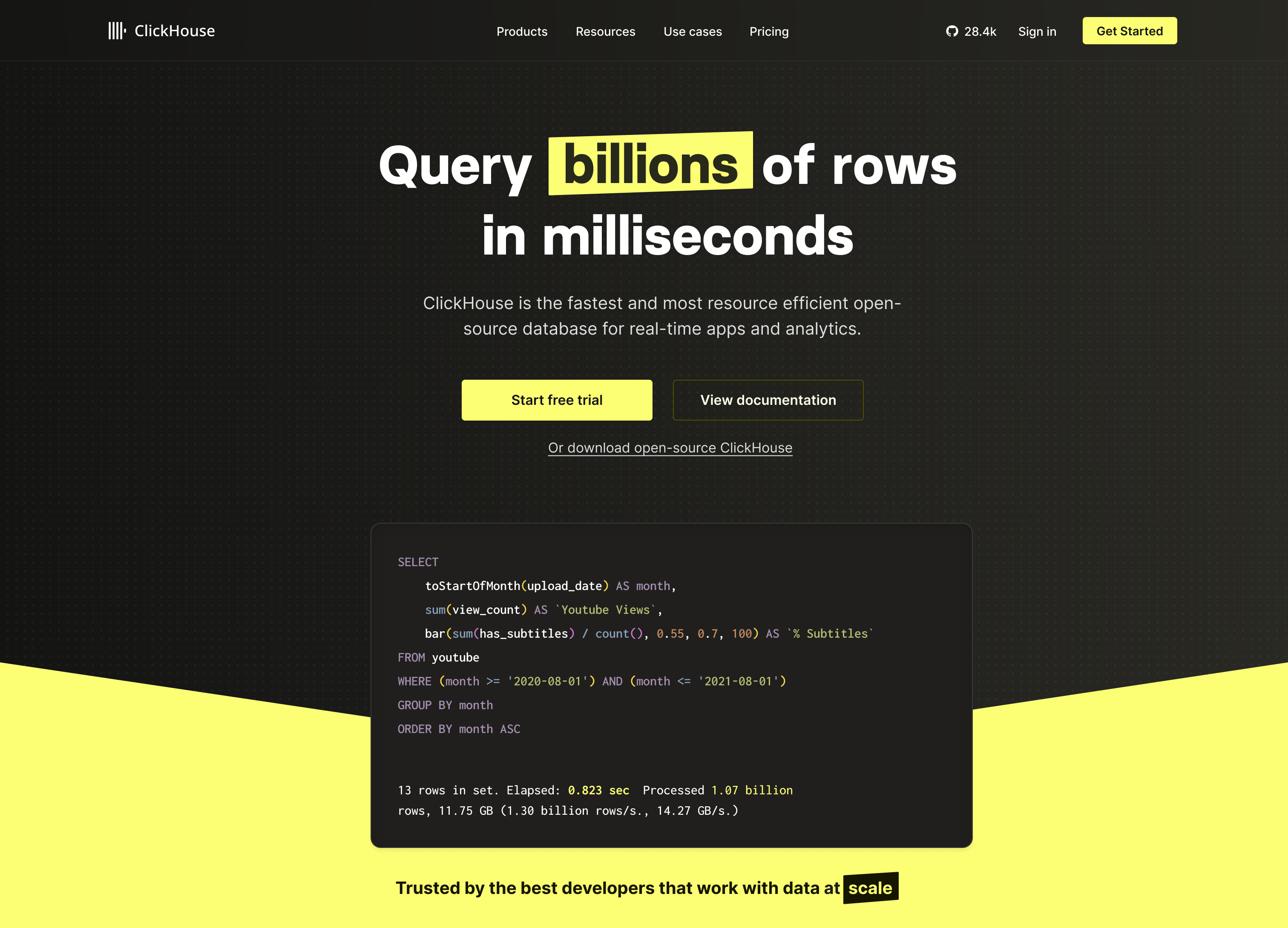
We toned down the initial website release a little, opting for a darker appearance to appeal to a developer audience, while our social media, and offline assets tend to be brighter. Over time we’ll bring that exuberance and brightness back to the website but we’re happy with where we are right now.
The general vibe is a bit of an '80s throwback with diagonal shapes and bold lettering. It's distinctive and we feel it evokes an emotional response, making it more likely to be memorable to those who encounter it. We're learning more about this brand every day as we create internal tools and conference materials, and we're excited to see how this evolves.

Producing a new brand was a massive undertaking, and accomplishing this with a small team in such a short amount of time is still quite staggering to me. Special thanks go to Justin, who I met with everyday and was instrumental in the creative process, and to Cristina and Daniel, who’s patience and hard work bringing these ideas to life cannot be understated.
Since launch, the support we received from colleagues across the company has been genuinely inspiring, and the reception the new brand has garnered, both internally and externally, has been overwhelmingly positive.
The new website was released in early April and can be visited at ClickHouse.com. The conference experience already debuted at AWS Stockholm, and the updated product UI will be coming later in 2023.
