Thoughts & Musings
A new look for Fight Scores
I'm happy to announce that version 3.0 of Fight Scores is now available to download from the iOS App Store. Behind the scenes this has been a complete rewrite, however I wanted to concentrate on the user facing changes today.
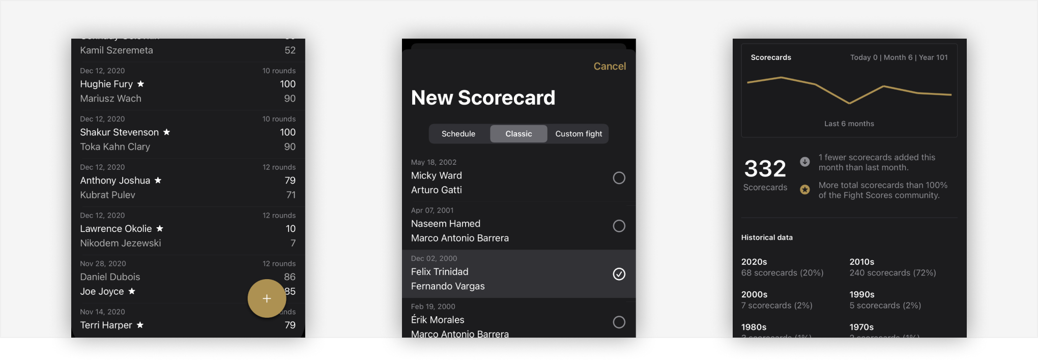
New look and feel. This update brings a more modern aesthetic that allows it to fit in seamlessly with iOS 13. Big bold titles, vibrant colours, and a swipe heavy UI are the orders of the day.
Magic button. The previous incarnation of fight scores used a lot of space on the “new scorecard” button. This version introduces the magic button, an ever present action that floats above the list of scorecards. This allows room to show more scorecards at any time.

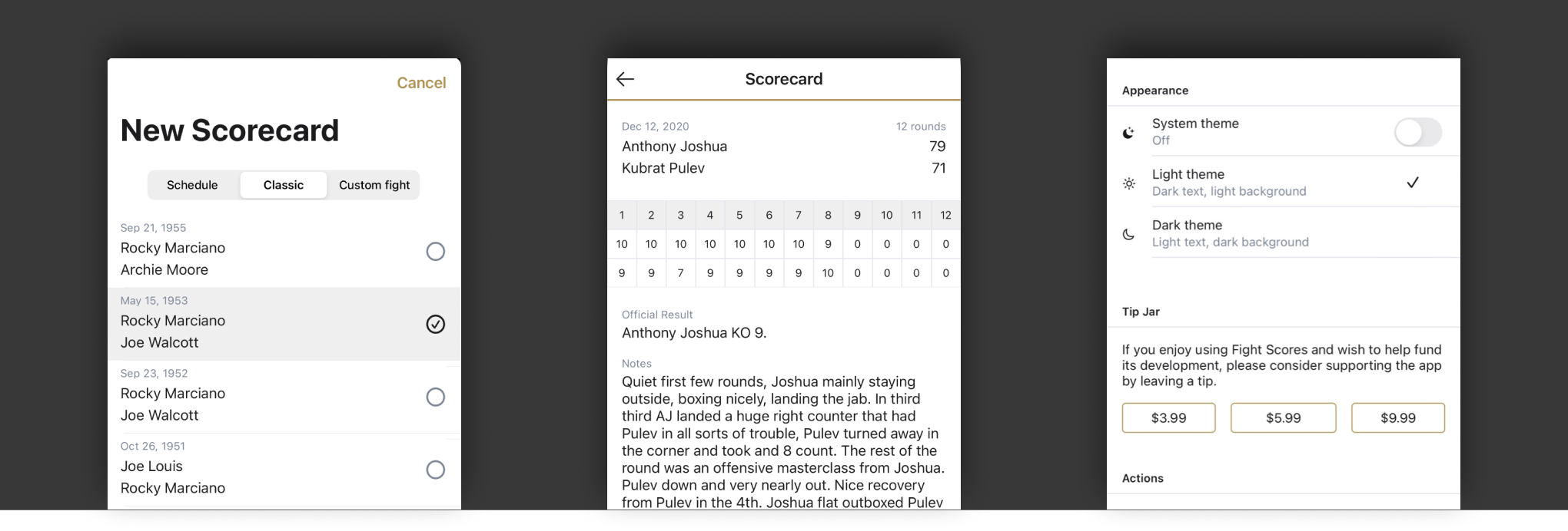
New scorecard UI. Due to the coronavirus pandemic of 2020, live sports were halted for a number of months. During this time fight fans relied heavily on rewatching the classics. Fight Scores makes this really easy to do. Where there were previously two new scorecard options: Schedule and Custom fight. Now there are three, with the addition of a Classics tab featuring more than fifty of the most monumental fights in boxing history. Users can use the intuitive list based Ui to select which fights they'd like to add.
Light and dark mode. For branding reasons, and because most people tend to scores fights at night, Fight Scores has always had a dark UI. I had received a few requests for a light option over the years, but with the release of iOS 13, and an operating system level theme, suddenly this behaviour became a priority. Rather than just inherit the OS theme, I wanted to give users the ability to choose which they'd prefer, Dark, light, or use the system default.

New profile. This is an area I see a lot of potential growth in the future. Fight scores now has a profile view that allows users to see trends around their list of scorecards. Users can see how many scorecards they've created in relation to the previous months, and also how active they are in comparison to other fight scores users. Fights are also broken down by decade to allow users to identify which eras they tend to score fights from.
Tip jar. Since I removed all ads and tracking from fight scores it has not been making me any income. I receive feedback from users asking how they can donate to help pay for the development costs. There's now three tip options.
Logo and icon. I also felt that it was time to update the Fight Scores logo. Rather than the Serif font FS which I felt was a little too complex to work well in the App Icon, I've gone for just an F made from a series of dots. It's a lot more abtract than the previous iteration, however after using it in development for the last few months I think it works well and helps communicate that more modern aesthetic.
![]()