Thoughts & Musings
The Process of Designing for a Hiking Site
A while ago I wrote about my process for relaunching my website, today I thought I’d go into a little more depth with regards to my design process. As an example I created a fictional project to work on, here are the details:
Project overview
Create a trail view page for a web app with the goal of allowing users to find and learn about new hiking trails throughout the globe.
OK so fairly simple, as I mentioned we’ll be concentrating on just the design process, meaning the app’s aesthetics and usability rather than the overarching flow, relationship management, model architecture and such. That in itself is an interesting topic and in the future I plan to write an article on how I approached it when developing Corkings
Disclaimer
In reality this task would require a lot of research and would also be required to fit in to the overall design or flow of the web app, we’re going to ignore that element and instead treat it as a stand alone page.
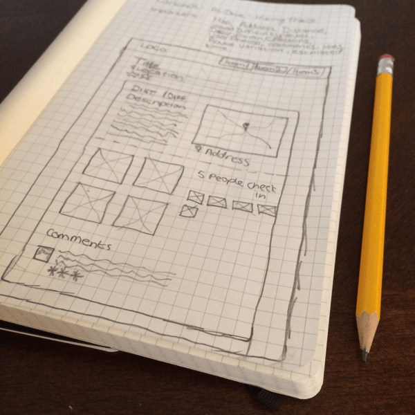
My first plan of action is to get my sketchbook out and jot down the goals of the page, in this case I came up with the following:
The aim of this page is to supply the user all of the information on a particular trail that they would require should they wish to hike it in the near future.
I theorized that a user would require the following information: trail name, trail address, visual feedback on rough route and location (in the form of a map), description, distance, estimated time, difficulty level and potentially the elevation level. The additional social elements would also prove handy: check ins, star rating, comments and photos.

Early sketch work
This gave me enough information to begin sketching possible layouts. I tend to design for mobile and desktop concurrently. While thinking about a visual element I’m instantly accessing how it will break down, meaning how will it fit into the loose responsive grid both the one that I have in my head, as well as the one I will be cobbling together when I reach the development stage. Each element I design will need to adapt as the screen size or device changes. Obvious examples of this are touch targets, imagery and icon/label usage.
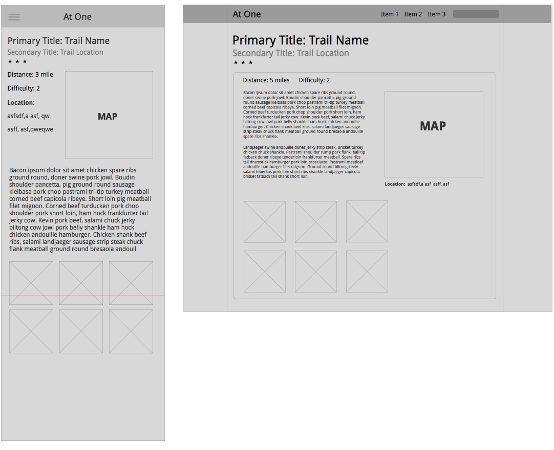
After my initial drawings I generally will move on to SketchApp for wireframing, again mobile and desktop for me are worked on side by side as this allows me to really think about the layout structure. I will often make a mental note of the levels of significance that I should be assigning each element. For example, in the trails web app, I’d be fairly certain that the location of the trail is the more important piece of information than the number of people who have completed the trail, however would I be so confident in assuming that photos are more important than user comments/feedback? These are the type of things that I think about when in the wire framing stage.
For mobile I design at @2x and using the of the dimensions of the iPhone 5/5S as it’s my preferred mobile platform. I generally design in portrait (640px by 1136px) and while doing so make sure to consider how the layout would look should the phone’s browser be in landscape mode, although I don’t often specifically wireframe for this.
It’s worth noting that at this stage I do not introduce exact measurements or font sizes, things continue to change and evolve in a design throughout the process and I like to allow myself the freedom to let that happen as I see fit. I use the wireframing stage for basic layouts and also because while creating them I’m often getting more visual ideas of how the final design will look, I find it somewhat therapeutic.

Basic Mobile and Desktop Wireframe
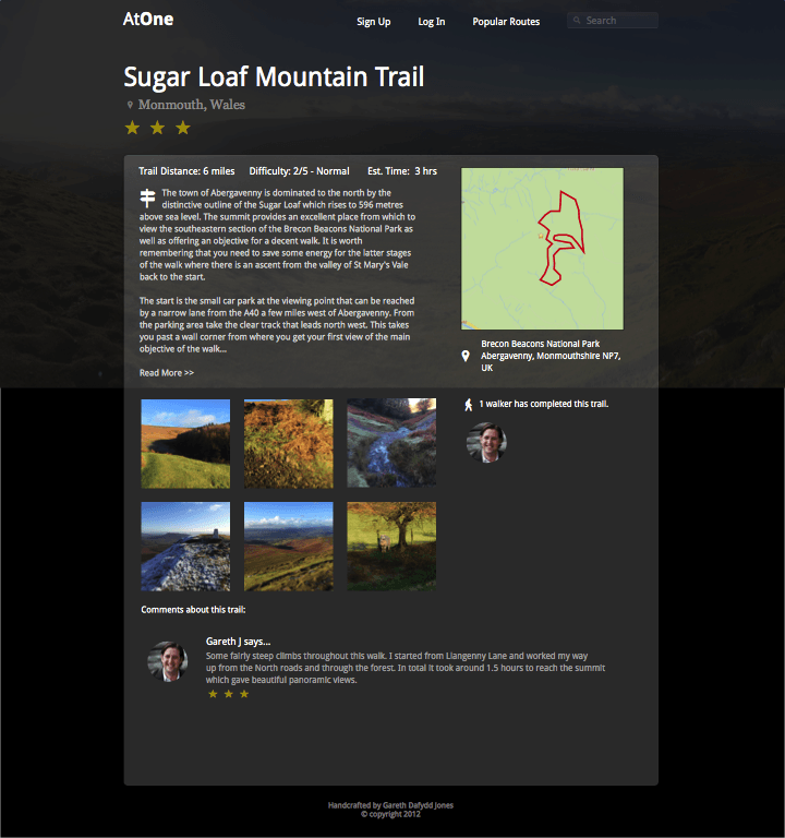
My next step is to begin filling out the design, for this, at least to begin with, I will stay in SketchApp. It is now that I generally make decisions on the ‘feel’ of the design, will it be light and spacious or dark and broody. Which font set shall I use? What colour should the links and buttons be? It’s at this stage that many big decisions are made. Often, once I have a sense of the direction I’m looking for, I waste no time in switching to the browser and complete the design as I go. For the purposes of this example however, I stayed in SketchApp to finish up.

Near Complete Design, click to see the full size version
Above is my near completed design, I went for a dark feel with a big, bold background image that I took from the top of a mountain a few weeks ago. I think that the vast landscape helps give the user a feeling of inspiration, something akin to a bird flying high above civilization. For fonts I kept it simple, most of the headlines and copy are Open Sans while the support text is often Georgia. In the design you can see the results of my significance levels as above the fold is a reductive navigation and search bar followed by a large headline with the name of the trail and it’s location. The map is easily readable from it’s position on the right, while the user has easy access to important information such as Distance, Difficulty and Estimated Time before delving into the trail description. Further down the page are the social elements, photographs taken from other users whilst on this trail along with a list of users who have completed this trail (the check in functionality) and any relevant comments that they may wish to make. In real life it’s likely that I would need to add other social buttons such as like on Facebook, or Tweet this trail, but for now I’ll avoid that area.
What do you think of this design? What would you improve? Get in touch via the social network buttons on the bottom left of this page if you wish to give me feedback. Next time I’ll be starting the development of this page and documenting how I went about doing that.